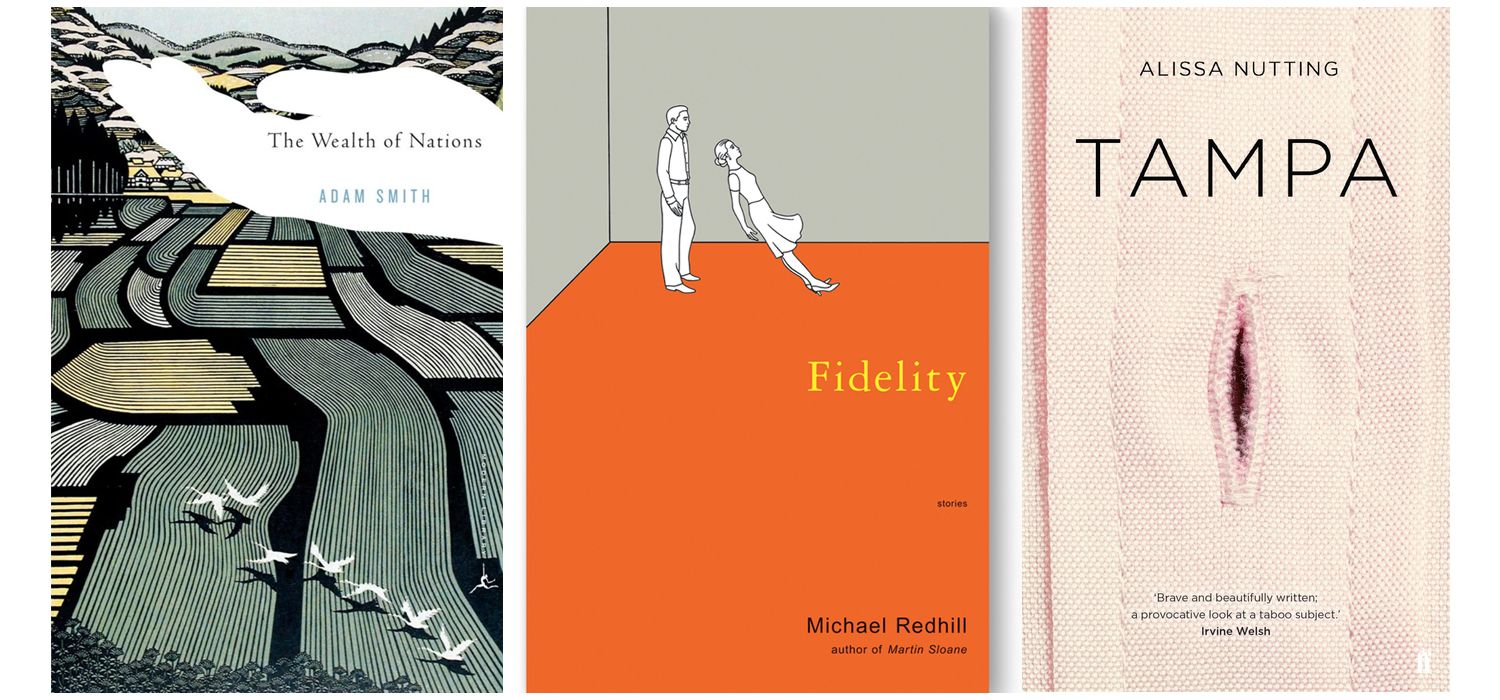
Oftentimes people pick up a book or a magazine after just viewing its cover page, be it because of the typeface used or the nice illustration. I myself fall victim under this phrase “Judging a book by its cover” – I believe it is only human nature to naturally be attracted to what is deemed beautiful or aesthetic in our own perspectives.
We sometimes forget how crucial the role of a cover page is. As cliché as it may sound, a cover design can either make or break a publication. Not only does it represent the brand or image, but it also reflects on how thorough the design has been thought out as well as its marketing efforts. Typically, when one discusses about the topic of cover design, we often either think about the font or the imagery used – but it is truly more than that. We should take some time to ponder on how the designer, the typographer, and the illustrator come together to form a coherent and significant cover design.
Maybe one of the more impactful cover page design that has often popped up in my mind would be Patrick Ness’ ‘More Than This’. A simple yet cleverly designed die-cut hardcover, it illustrates a grid with an open door at the bottom right-hand corner with the text ‘More Than This’ printed on it. It was designed by Matt Roeser, a senior designer at independent children’s publisher Candlewick Press in Massachusetts.

Published in 2013, More Than This follows a teenage boy named Seth who, after drowning in the ocean, wakes up alone on a desolate suburban English street in what he believes to be hell (“More Than This (Novel)”). The door illustrated in the book cover might denote that the ‘hell’ presumed by Seth is more than what he originally thought, and I believe it also in a way brings the reader into the depths of the novel’s plot by opening the “door” to the book.
Roeser has mentioned before in an interview for The Casual Optimist in 2014 in regards to his style of designing book covers: “Whether it’s a die-cut through the case for More Than This, or a ¾ jacket wrapped around a printed case, or stamping the entire design in foil, I enjoy playing with the materials in new ways.” This made me rethink of how far a cover design can go. Sometimes we focus too much on the small details of typography, illustration and alignment that we neglect other elements such as the existence of material play. It is interesting how a die-cut of a door can hold such a strong meaning without using too many design elements.
That being said, there are many other phenomenal cover page designs inspired by various factors such as industrialism, revolution and trends across eras. In this post I have only briefly covered on book cover design, and I shall return to this intriguing topic of cover designs soon.
Works Cited:
(1) “More Than This (Novel)”. En.Wikipedia.Org, 2013, https://en.wikipedia.org/wiki/More_Than_This_(novel)
(2) Dan. “Q & A with Matt Roeser, Candlewick Press.” The Casual Optimist, The Casual Optimist, 2014, http://www.casualoptimist.com/blog/2014/06/23/q-a-with-matt-roeser-candlewick-press/
